Our 69th Guinness ad is a fairly simple one, showing a half-empty pint of Guinness and the slogan “Life Is Brighter After Guinness” in large letters followed by the more familiar “Guinness is Good For You” in smaller print below that.
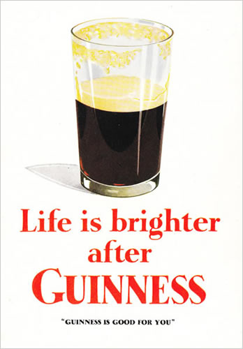

Our 69th Guinness ad is a fairly simple one, showing a half-empty pint of Guinness and the slogan “Life Is Brighter After Guinness” in large letters followed by the more familiar “Guinness is Good For You” in smaller print below that.

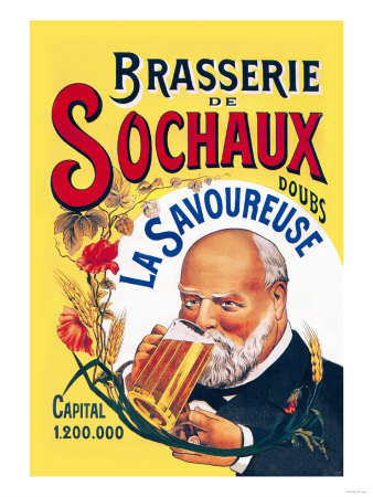
Friday’s ad is for a French brewery, Brasserie De Sochaux, which closed in 1979. It looks late 19th century, but who knows. I’m not seeing the old gray-haired dude in the military (or bellhop?) uniform as making me want to drink their beer. Plus, it just seems too busy.
Thursday’s ad may in fact not actually be an ad. It could just as easily be sheet music or the Playbill from a show. But the “Prince of Pilsen” sounds like a great title for a musical. I wonder why the woman on the left is dressed like the United States?


This week’s work of art is by an artist from Argentina, Carlos Morel. I saw the original in Buenos Aires at the Museo Nacional de Bellas Artes. The painting is known as Payada en Una Pulperia or Duel in the Taproom and was created in 1840.
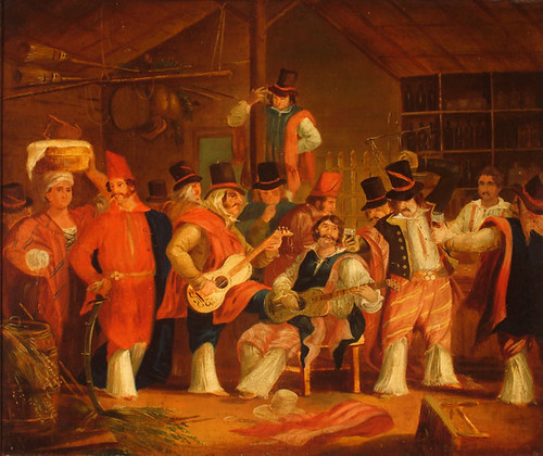
The duel depicted in the painting is of the musical variety, with two guitar players squaring off against one another to the general merriment of all the people drinking in the taproom.
Morel is considered to be Argentina’s first great painter. He was born in Buenos Airies in 1813 and lived until 1894, painting a great number of watercolors and oil paintings throughout his career. Here’s a translated biography
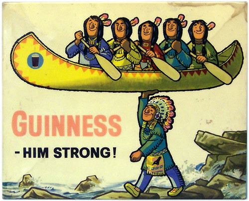
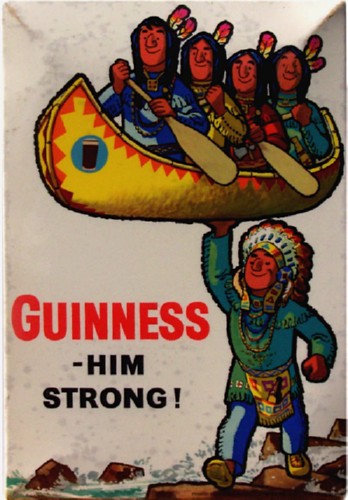
Our 68th Guinness ad is an another odd one, the second from a time when sensitivities toward Native Americans weren’t particularly high. Using for a second time the cringeworthy tagline “— Him Strong,” this one shows not the iconic Toucan but a smiling group of Native Americans sitting in a canoe being held up by, presumably, the chief, who has a bottle of Guinness tucked into his pouch.
And here’s a second ad of the same scene, but from a different angle.
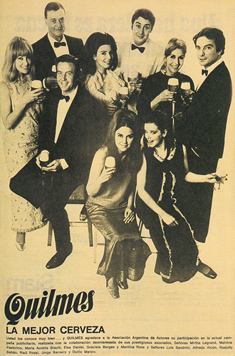
Friday’s ad is the last for Quilmes, from 1968, and it certainly looks like quite a party. Love the hairstyles.
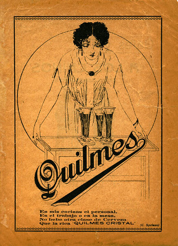
Thursday’s ad is for Quilmes Cristal, and is on some kind of parchment, or at least paper made to look that way. I don’t actually know how old it is, but it looks old, or perhaps again it was made to look that way.
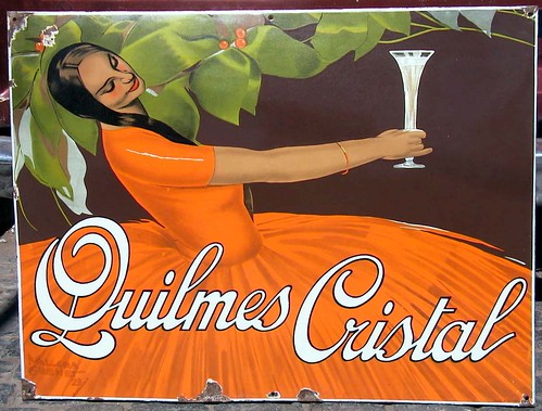
Tuesday’s ad is another one for Quilmes, probably also from around the 1920s or 30s. It was for their light-colored Cristal. I saw an original of this beautiful sign last night in the home of one of Argentina’s most prominent breweriana collectors. His home was amazing, literally filled with beer collectibles from all over the world, but with a special emphasis on local Argentinian beer.
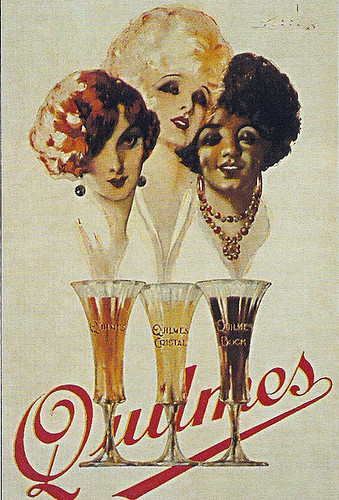
Monday’s ad is for a South American beer, since I’ll be in Argentina all week, judging at the South Beer Cup. It’s for Quilmes, perhaps Argentina’s best known brand around the world. The ad is from around the 1920s and features a painting of three women with different color hair, one for each of the Quilmes beers.
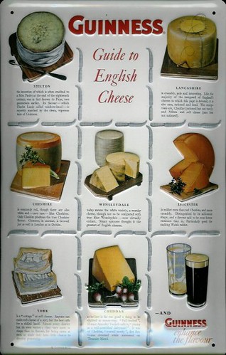
Our 67th Guinness ad, in honor of the Great Online Beer & Cheese-Off yesterday, is a poster Guinness did in 1965 showing a variety of English cheese with the tagline “Guinness goes well with food.”
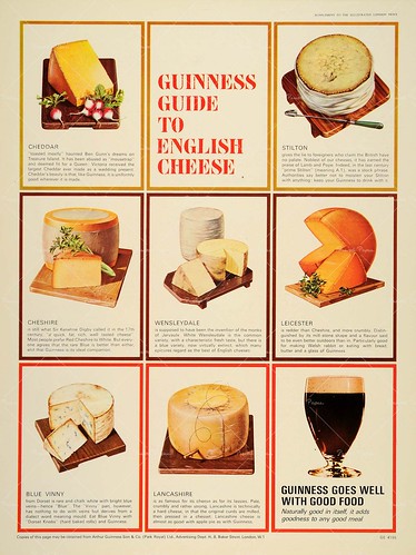
They also made a metal sign of the cheese poster, as well, though with a different tagline. In the metal version, it’s “— And Guinness enhance the flavor.” The cheeses, too, are almost the same, but not exactly, plus their order is changed up.