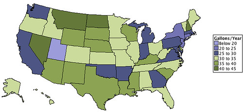
Today’s infographic shows Annual Beer Consumption Per State Per Capita, based on data from 2009. It was created to answer the question of whether or not there “is there a link between climate and beer consumption?” If you’ll pardon the pun, the results seem allover the map, so I’d have to conclude that the answer is “no.”
Beer Serves America Interactive Map

Today’s infographic is an interactive map of the country created by the Beer Institute for their Beer Serves America, which used to be a separate website, but has since been folded back into the BI website. In the interactive map, holding the cursor over the pint glass in each state bring up additional data about that state, and provides a link to a pdf with much information about the economic impact of beer for each state.
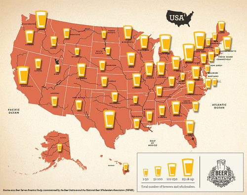
Click here to see the interactive map full size … and interacting.
Taking Over America’s Taste Buds
![]()
Today’s infographic, an overview of Craft Beer, Taking Over America’s Taste Buds, is not strictly about Ohio, but its creator, Molly Denning is from Columbus and created it as an Ohio State school project to be used in the Craft Beer Village at the Bunbury Music Festival, which begins today in Cincinnati.
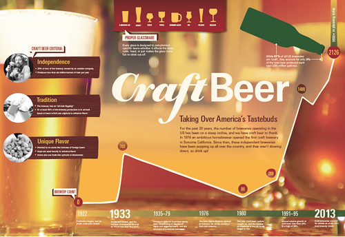
Click here to see the infographic full size.
The Beer Belly Of America, Part 3

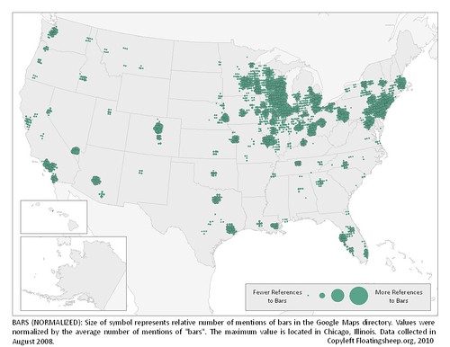
Today’s infographic is part three of three, created by Floating Sheep in 2010, using data collected in 2008. It’s from a post entitled the Beer Belly of America. The third map shows a more normalized version of yesterday’s map, showing the “relative mentions of bars in the Google Maps directory,” which was accomplished using the average number of bar mentions.
The Beer Belly Of America, Part 2
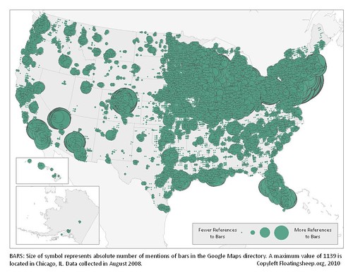
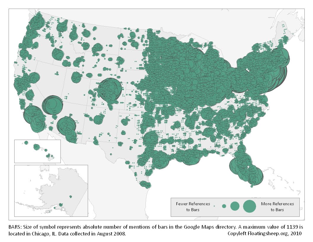
Today’s infographic is part two of three, created by Floating Sheep in 2010, using data collected in 2008. It’s from a post entitled the Beer Belly of America. The second map shows the “absolute mentions of bars in Google Maps directory.” Essentially it shows the location of every bar in America, and where the concentration of them is throughout the country.
The Beer Belly Of America, Part 1
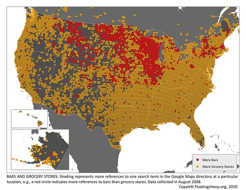
Today’s infographic is part one of three, created by Floating Sheep in 2010, using data collected in 2008. It’s from a post entitled the Beer Belly of America. The first map shows geographic references to bars vs. grocery stores, and where (in red) the bars are mentioned more frequently (and then they compared census data, which corroborated their findings).
Click here to see the map full size.
The Geography Of Bars

Today’s infographic comes from an Atlantic article on The Geography of Bars and Restaurants. The map uses data from the 2012 census and county business patterns. According to their data, New Orleans has the most bars per households, and San Francisco ranked 8th, with 6 bars for every 10,000 people. It’s also hard to see because the map is relatively small, but there’s a high-density bar area in Northern California in what I believe is Mendocino County.
And while I was mostly interested in the bars, the restaurant data is quite interesting, as well. San Francisco ranked #1 for restaurants per household, with 39.3 per 10,000 residents. That’s roughly one restaurant for every 255 persons.
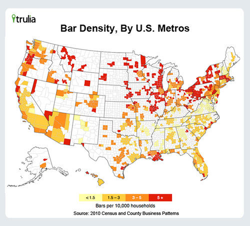
Click here to see the map full size (and sorry that’s as big as it gets).
Caffeine Vs. Alcohol: Which One Better Enhances Creativity?

Lifehacker had an interesting piece on whether caffeine or alcohol was better to help someone “be more creative and get work done.” The title, Drink Beer for Big Ideas, Coffee to Get Them Done, sort of gives it away, but it’s worth a read to see how author Mikael Cho comes to that conclusion.

One Drink Too Many
![]()
Today’s infographic is entitled One Drink Too Many, and is subtitled “Is it the result of Nature or Nurture?” It was created by Clarity Way, which calls itself the “Premier Holistic Addiction Rehab & Drug Treatment Center.” And while there’s some great info there, there’s also some odd bits, too. For example, the odds of becoming an alcoholic if your family has a history of it or doesn’t is 50%, essentially meaning it makes no difference. The top three reasons people say they drink — to socialize, relax or just enjoy the drink — represents 88% of all reasons, meaning the vast majority of people don’t drink for the wrong reasons. Fully 68% become “happy” after three drinks, while only 1% get “angry” and just 2% are “annoying,” hardly cause for alarm. These, and many of the others, don’t seem to really indicate that alcohol abuse is the widespread problem that most neo-prohibitionists continue to insist.
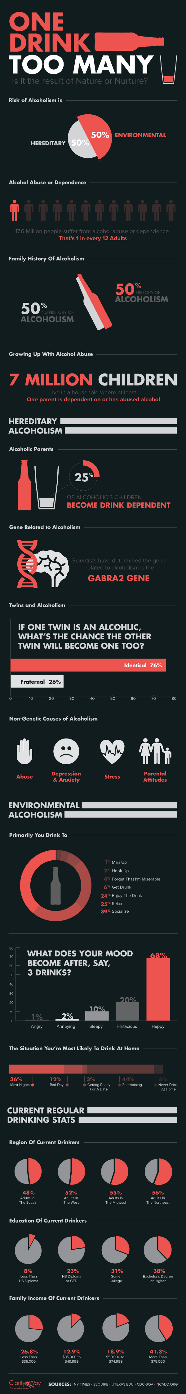
Click here to see the infographic full size.
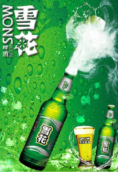
The World’s Top 10 Beer Brands

Drinks Business, a European trade publication, on Tuesday published their list of the Top 10 Biggest Beer Brands, I believe as of the end of 2012.
- Snow Beer, 74.8 (China) [SAB Miller]
- Tsingtao, 57.9 (China) [Tsingtao]
- Budweiser, 40.4 (U.S.) [ABI]
- Yanjing Beer, 39.6 (China) [Beijing Yanjing Beer Group]
- Bud Light, 36.7 (U.S.) [ABI]
- Corona Extra, 31.6 (Mexico) [ABI]
- Skol, 29.9 (Brazil) [Carlsberg]
- Heineken, 29.1 (Netherlands) [Heineken International]
- Coors Light, 25.1 (U.S.) [Molson Coors]
- Brahma (Brazil), 18.1 [ABI]
The rankings are based on millions of barrels, which is listed after the name. The top beer, Chinese Snow Beer sells roughly 50% more than the second place beer, Tsingtao. So it’s not even close. The number ten beer, Brahma, sells only about a quarter of Snow.
Three of the top 10 brands are Chinese, not too surprising given that it recently became the largest consumer of beer worldwide. Anheuser-Busch InBev has four beers on the list, the most, by far, from a single company. It’s also interesting that Budweiser is selling more than Bud Light internationally. That says a lot about how effective the marketing of low-calorie diet beer is here in the U.S.
Snow Beer, the world’s best-selling brand.