
Today’s infographic is courtesy of the Karl Strauss Brewery in San Diego, who created this Beer Myths Debunked infographic.
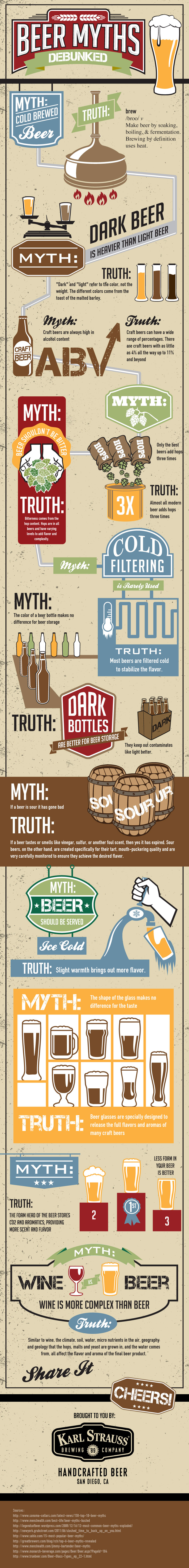
Click here to see the infographic full size.

Today’s infographic is courtesy of the Karl Strauss Brewery in San Diego, who created this Beer Myths Debunked infographic.
Click here to see the infographic full size.

Today’s infographic is a Diagram of Yeast Production, created by the website Explore Yeast.
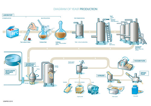
Click here to see the diagram full size.

Today’s infographic is from Mensa, believe it or not, showing American Mensa members favorite beers. If it shows anything, it’s that Mensa members aren’t quite as smart as they think they are. It’s not that Blue Moon or Samuel Adams Boston Lager are bad beers — they’re fine, really — but their top ten also includes Heineken, Corona, But Light and Stella Artois — which aren’t. Really there’s only three beers on their list I truly like and another I think is okay, if overrated. Of course, they only gave members a list of thirty beers chosen for their popularity and brand recognition (though no word on how they determined brand recognition), so maybe that was the bit that wasn’t terribly smart.
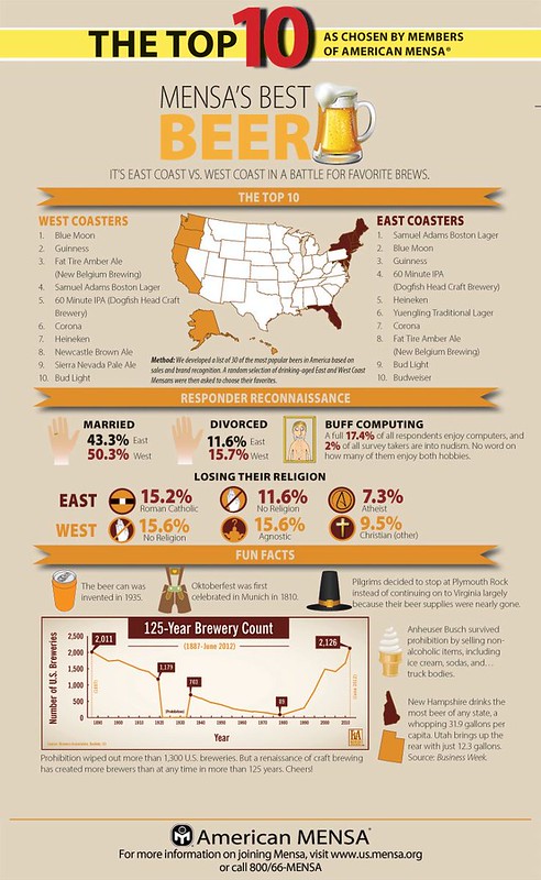
Click here to see the infographic full size.

Today’s infographic is another diagram of the Brewing Process, this one from the Beer Masons, a beer appreciation society in Australia.
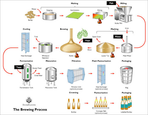
Click here to see the diagram full size.
One interesting addition is they point out that beer is known by many names in the process from grain to glass, and list them in a flowchart.
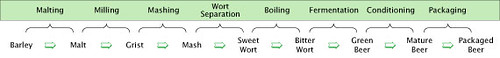
Click here to see this one full size.
Today’s infographic is from Orchestrated Beer, which is business management software for craft breweries. They created the infographic below to visually show what their software can help breweries do, showing the supply chain from farm to consumer.
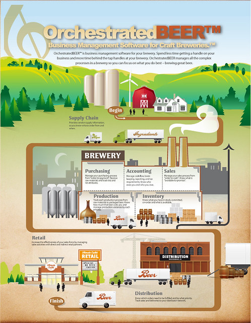
Click here to see the infographic full size.
There’s also another version of the graphic, only slightly different. And the graphic design website Behance, features yet a third version of the infographic, this was designed for a brochure.
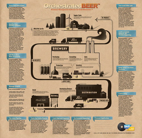
Click here to see the infographic full size.
![]()
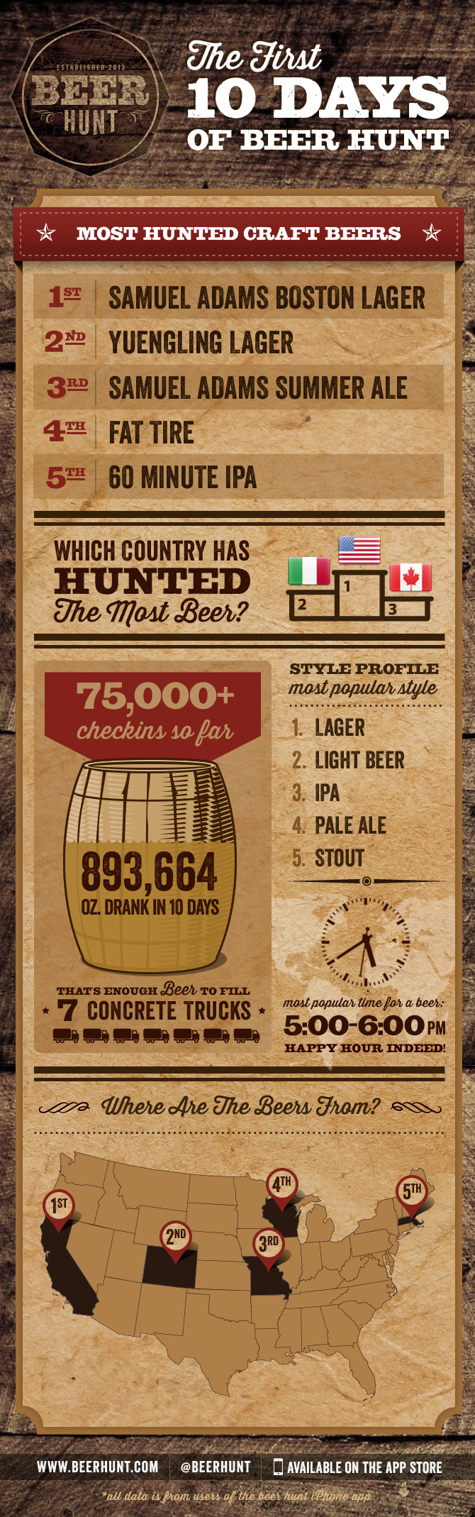
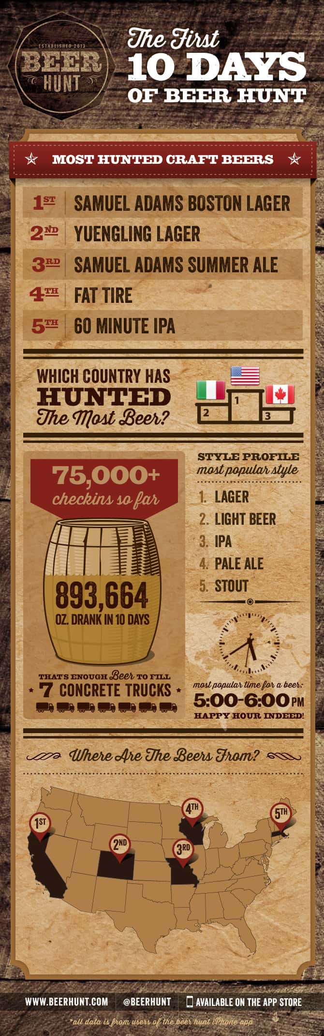
Today’s infographic is an interesting one. It was created by the makers of a new iPhone app, Beer Hunt, which looks to be giving Untappd a run for the money. It was created by Monkey Inferno, located in San Francisco. Essentially, it gives the stats of beer check-ins for Beer Hunt’s first ten days of use. It will be interesting to see it updated for the first month, first quarter, etc. to see how the data changes.
![]()
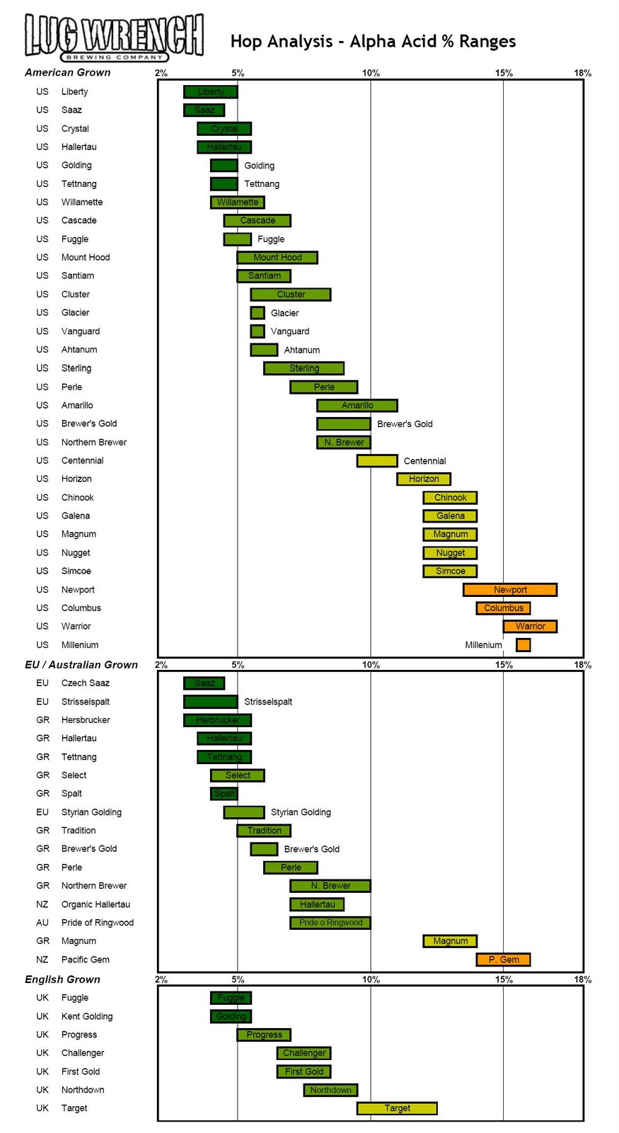
Today’s infographic is another one from Lug Wrench Brewing, this one showing Alpha Acid Ranges By Hop Variety, based on the info provided by HopUnion.

Today’s infographic is a local one, for the East Bay of the San Francisco Bay Area. It ran last week in the East Bay Express, and following the chart will lead you to discover What’s Your Local Summer Beer? But the answers are all beers brewed locally, in the East Bay or San Francisco, not that that’s a bad thing.
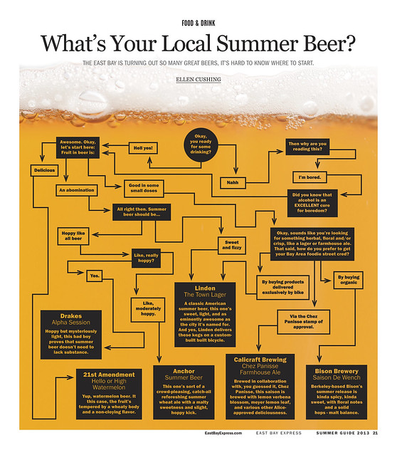
Clici here to see the chart full size.

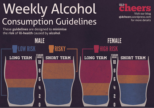
Today’s infographic is from Australia, showing their recommended Your Weekly Consumption Guidelines as an infographic. It was created by the Australian website QLD Cheers.
