Thursday’s ad is for Schlitz, from 1943. A bit of a play on words, it seems to equate Swallows, the birds, and swallowing beer, with the slogan “Happy Swallows! No bitterness.” A bit of a stretch?
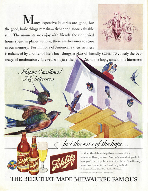

Thursday’s ad is for Schlitz, from 1943. A bit of a play on words, it seems to equate Swallows, the birds, and swallowing beer, with the slogan “Happy Swallows! No bitterness.” A bit of a stretch?
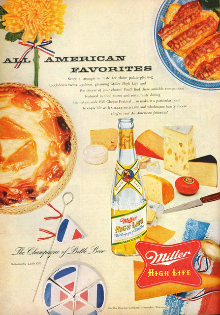
Wednesday’s ad is for Miller High Life, from what looks to be the 1950s. It’s nice to see cheese and beer advertised together, especially long before the recent artisanal cheese revolution. Although given the all-American theme, isn’t that brie at the bottom left of the ad, flying the French tricolor?
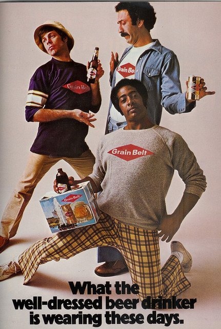
Tuesday’s ad is for Grain Belt, from — I’m just guessing here — some time in the 1970s, based on the fashion, or lack thereof. I love the mock posing as each holds a different package, a regular bottle, a can and a stubbie.
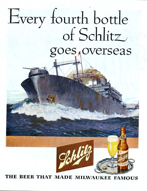
Monday’s ad is for Schlitz, from 1945. Apparently, one in four bottles of Schlitz brewed was sent overseas for the troops at this point in the war, which was the last year before it ended.
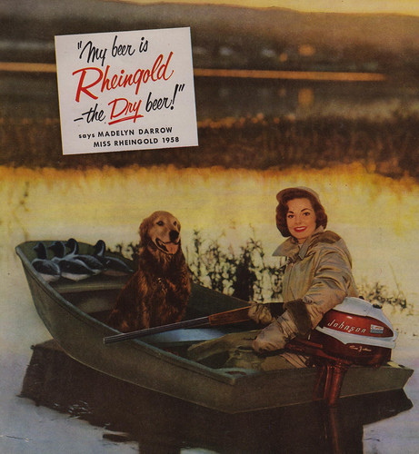
Friday’s ad is for Miss Rheingold for 1958, Madelyn Darrow, showing her in a boat on a lake, duck hunting. I’m not sure how her dog is going to be much help.
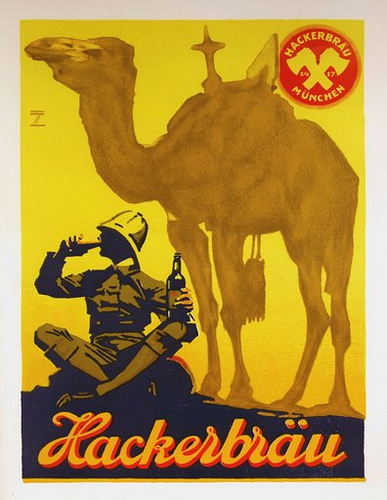
Thursday’s ad if for the German beer Hackerbrau, which is the Hacker in Hacker-Pschorr. The ad is from around 1920, long before they merged again in 1972. The ad was illustrated by Ludwig Hohlwein , who did a number of beer ads during the same period of time.
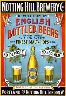
Wednesday’s ad makes quite some bold claims. It appears to be a 19th century ad for the newly modernized Notting Hill Brewery Co., which had just started a “revolution in English Bottled Beer Produced Entirely on a New System.” I especially love the twin banners, that don’t quite seem to work together: “No Deposit” and “No Sediment.”

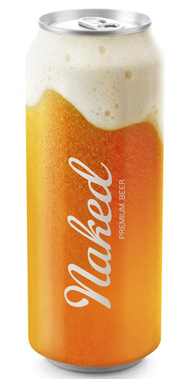
This is an interesting design, generic beer cans, made to look as if they were essentially clear and showing the contents inside, albeit in an idealized way. They were created by Timur Salikhov, a designer from St. Petersburg, Russia.
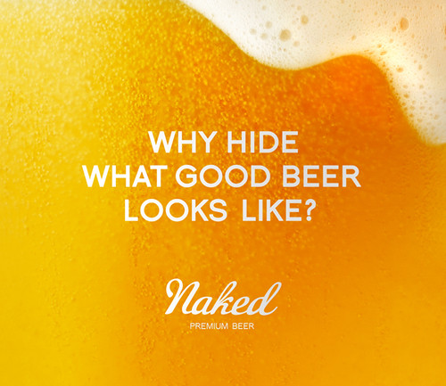
He starts with the premise “Why hide what good beer looks like?”
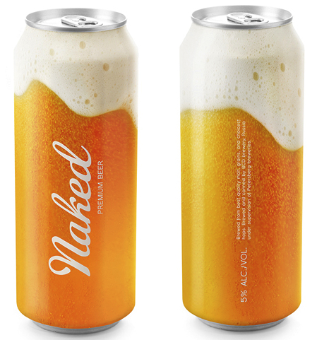
And then he designed the cans to appear as if they were a freshly poured glass of beer. It’s fun concept and apparently he’d like to sell the idea to a brewery. I think the only unfortunate aspect of his design is that without additional branding on the package, it may look too generic. BUt it sure looks like a beer I’d like to open.
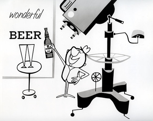
Tuesday’s ad is again for Drewery’s, and I believe it’s probably a still from an animated television commercial. It has the stylized look of the animation from that period of time. It must have been a fun commercial.
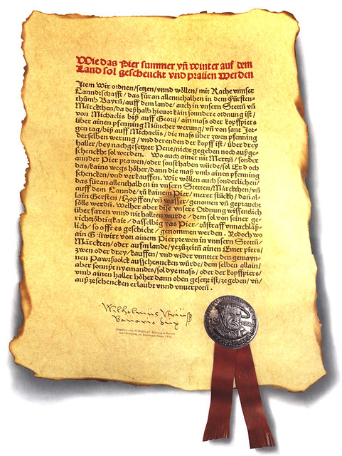
Monday’s ad is the 700th ad in this series! So I wanted to make it something special. This is a replica poster of the original 1516 Reinheitsgebot, one of history’s best marketing gimmicks. I’m not sure who it was created to promote, but it’s still a pretty cool piece of breweriana. Happy 700th.