
Wednesday’s ad for Ballantine Ale, from 1945. Anticipating the post-war boom in home construction, it shows a couple looking over the blueprints for their new home, although the salesman holding them looks a little sleazy to me.
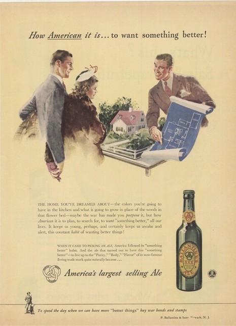

Wednesday’s ad for Ballantine Ale, from 1945. Anticipating the post-war boom in home construction, it shows a couple looking over the blueprints for their new home, although the salesman holding them looks a little sleazy to me.

Today’s infographic is part one of three, created by Floating Sheep in 2010, using data collected in 2008. It’s from a post entitled the Beer Belly of America. The first map shows geographic references to bars vs. grocery stores, and where (in red) the bars are mentioned more frequently (and then they compared census data, which corroborated their findings).
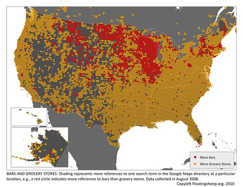
Click here to see the map full size.

My brother-in-law sent me this video this morning. There are a million ways to open a beer bottle, and this video includes a lot of different ones, including a few that seem pretty impractical (rendering the beer undrinkable) and some that look downright dangerous, but then there also some clever and funny ones, too. Enjoy.
Tuesday’s ad for Pabst Blue Ribbon, from 1954. Part of PBR’s “What’ll You Have” series, this one is tennis-themed, with a white tennis sweater emblazoned with Pabst’s tagline by the courts, back in the days when they still used white balls and … well, wore sweaters. Still not quite sure what made the beer better, though.
![]()
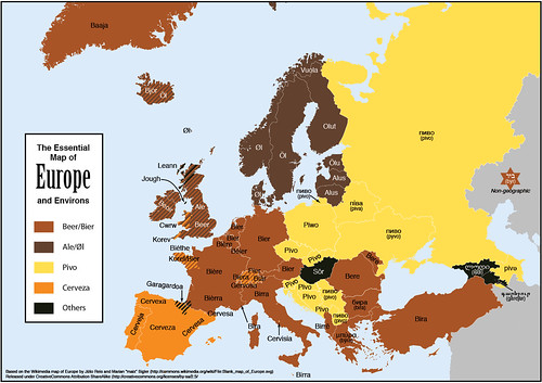
Today’s infographic was sent to me last night by my good friend Maureen Ogle, author of Ambitious Brew, and the soon-to-be-published In Meat We Trust. She knows of my love of language and especially beer words. I have my own growing collection of the word Beer in Other Languages, but Feòrag NicBhrìde of Scotland created the Essential Map of Europe and Environs, which is essentially a map showing the various ways in which Europeans refer to beer, helpfully divided by language types or origins.
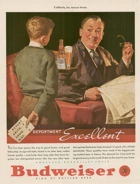
Monday’s ad for Budweiser, from 1947. Showing a young boy whose report card was less than stellar trying to soothe the beating he was about to get by bringing his father a tray of Budweiser. I’m not quite sure he really thought this through. Is getting Dad drunk really the way to go here? And what exactly does “Deportment Excellent” mean? I guess I’m getting a failing grade, too.
![]()
Today’s infographic is a Hop Flavour Spectrum, created by an Australian company HPA. They describe their Hop Flavour Spectrum as follows:
The Hop Flavour Spectrum has been created through years of research, experimentation and conversations with brewers, and by tasting a few beers along the way. It’s what we believe, and we want to build the spectrum with what you think too. Our hop varieties are divided into four flavour profiles: fruit, floral, spice and resin. This allows brewers to compare varieties and get an understanding of how each hop may impact the flavour of beer.
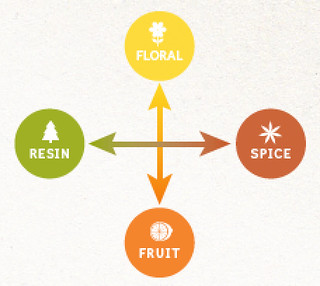
Then they took that scheme and placed the hops that their company carries on the spectrum, depending on each hops’ characteristics. Beverage World, in describing it, “The Hop Flavour Spectrum goes beyond the limitations of chemical analysis to provide an effective tool for comparing varieties and understanding how each hop may impact the flavor of beer.” You can click on each variety listed to see additinoal information about it. It would be cool to see even more varieties added to the spectrum.
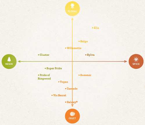
CLick here to see the original interactive chart.
![]()
Today’s infographic is entitled the Science of Getting Drunk, and shows what happens inside your body when you drink alcohol, how it affects the brain, identify different levels of drunkeness and also what it takes to get there. It was created by Best Colleges Online.
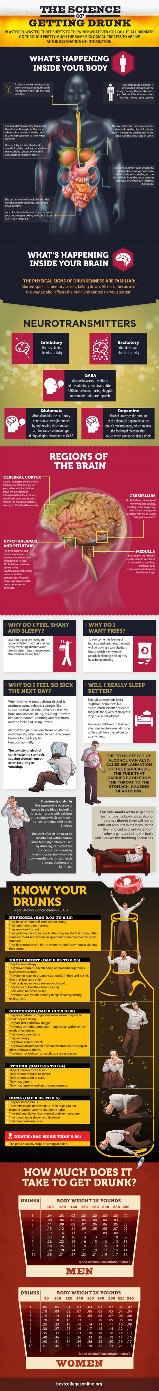
Click here to see the infographic full size.

Today’s infographic comes from an Atlantic article on The Geography of Bars and Restaurants. The map uses data from the 2012 census and county business patterns. According to their data, New Orleans has the most bars per households, and San Francisco ranked 8th, with 6 bars for every 10,000 people. It’s also hard to see because the map is relatively small, but there’s a high-density bar area in Northern California in what I believe is Mendocino County.
And while I was mostly interested in the bars, the restaurant data is quite interesting, as well. San Francisco ranked #1 for restaurants per household, with 39.3 per 10,000 residents. That’s roughly one restaurant for every 255 persons.
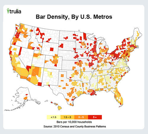
Click here to see the map full size (and sorry that’s as big as it gets).
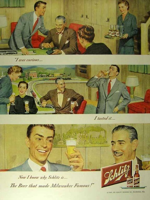
Friday’s ad for Schlitz, from 1949. It’s from their long-running “I was curious …” series, that featured three-panel stories that always ended with people drinking Schlitz beer. This one features a younger couple visiting the home of an older one, with the older man showing off his model train layout … and, of course, his superior taste in beer.