Monday’s ad is a 1955 ad for Schlitz with the oddball slogan “Your thirst can ‘feel‘ the difference.”
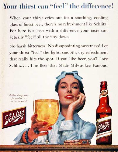

Monday’s ad is a 1955 ad for Schlitz with the oddball slogan “Your thirst can ‘feel‘ the difference.”
![]()
File this under news of the weird. According to the UK’s The Sun, the European Patent Office had to reverse their decision denying a company the right to produce a beer called Fucking Hell, when they were able to prove that Fucking is a real town in Austria. Or rather village, since there are only 104 people who live in Fucking, which is just 2-1/2 miles from the German border.
According to Wikipedia,
It is believed that the settlement was founded around the 6th century by Focko, a Bavarian nobleman. The existence of the village was documented for the first time in 1070 and historical records show that some twenty years later the lord was Adalpertus de Fucingin. The spelling of the name has evolved over the years; it is first recorded in historical sources with the spelling as Vucchingen in 1070, Fukching in 1303, Fugkhing in 1532, and in the modern spelling Fucking in the 18th century, which is pronounced with the vowel oo as in book. The ending -ing is an old Germanic suffix indicating the people of the root word to which it is attached; thus Fucking means “(place of) Focko’s people.”
Brewery spokesman Stefan Fellenberg said they plan to brew a Helles style beer. After years of trying on vain to keep people from stealing their town’s sign, and engaging in intercourse either in front of it or in town, the village instead decided to cash in instead. They may have gotten the idea from nearby Wank Mountain residents, who gave them some advice recently. Frankly, I can’t really blame them, though no doubt the U.S. will never give label approval. Guns and violence, yes. Sex, never. Even the Sun piece wouldn’t print either the word Fucking or Wank even though they’re legitimate place names. I’m constantly amazed at how utterly fearful we are about just … words.
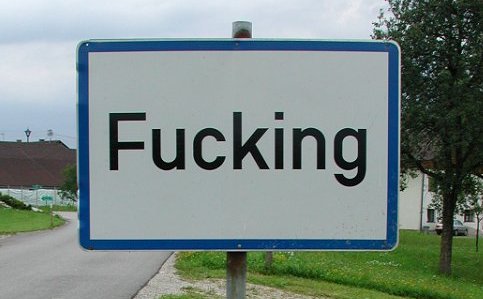
Here’s another humorous addition about the signs in the village. “One version of the sign features the village name with an additional sign beneath it, with the words “Bitte — nicht so schnell!”, which translates from German into English as “Please — not so fast!” The lower sign – which features an illustration of two children — is meant to inform drivers to watch their speed, but tourists see this as a double-meaning coupled with the village name.”

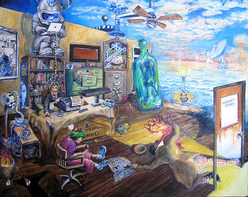
Today’s work of art is by a local artist, from nearby Sonoma County, by the name of Tom Payne. He’s embarked on a series of beer paintings, at least one of which has appeared in All About Beer magazine. So far, five paintings in his Beer Series have been completed, with more promised to follow. I think my favorite so far is Jack o’ the Green.

Here’s how Payne describes the painting:
Then came Mad Lloyd’s Jack o’ the Green Summer Ale. A parade festival of sorts, including the Green Man, the Lord of Misrule (whose appearance at a Summertide Festival caused me no end of cognitive dissonance), an alligator playing a trombone and various other parts and parcels.
But a close second has to be Mad Lloyd’s Tumultuous Uproar Imperial Stout, see below.
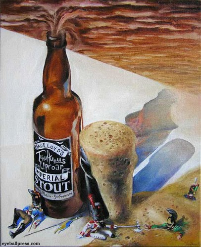
That was the second beer painting an in essence the one that set Payne down the path. All his work has a great, surreal quality, reminiscent of Max Ernst or the much earlier Hieronymus Bosch. There are lots of mysterious, fun details painted throughout every nook and cranny of each work.
Here’s a part of his biography, taken up starting with his arrival in Sonoma.
I moved to Sonoma County and started oil painting late in 2002, taking a few classes at the Santa Rosa Junior College to get things rolling. I discovered that oil is “where it’s at.” Pen & ink has always been the thing, but oil is the blastocyst, no question.
I am “interested in the spaces between line and form, real and imaginary, accident and purpose, defined and mysterious–figures that turn into landscapes and landscapes that become figures” it says here… how odd. I see things wrong (I also hear things wrong), and that’s what the “deal” is apparently.
I still draw and paint and make wine and wander about. Time continues to become a burgeoning apparatus. The wild turkeys are closing in and there is very little time left of time. So we may as well “do right” and “come about” in the appropriate manner.
Blah blah, crappy crap. And cetera. Aliusque tambien.
There’s much more at Payne’s website, Eyeball Press, where you can see galleries of paintings, and big paintings along with drawings and much else. He also sells his own work and takes commissions, too.
And here’s one more beer painting, Too Many Secrets Porter.
![]()
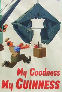
Our eleventh Guinness poster by John Gilroy is another “My Goodness, My Guinness” one, this time featuring a crane about to snatch another construction worker’s Guinness.
Friday’s ad is for Miller High Life from 1952 and features a female golfer and the tagline “The Lady Chooses.” I love the hat with tees in them, and did you notice she’s wearing a golf glove on both hands.

![]()
Steve McDaniel and the folks trying to launch Oakland Brewing Co. have some good news. They’ve found a location, finally. It’s the Old Cottonmill building at 1010 22nd Avenue in Oakland. It looks like a great old brick building with some history to it. As Steve is quick to remind me, they still have a very long way to go before the building can be turned into a working brewery, but if their luck holds they hope to have beer in the market by the end of 2010.
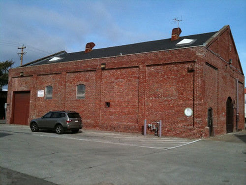
The building, I’m told, is located “a short diagonal off Livingston Street (terminating at I-880), which intersects Embarcadero where Quinn’s Lighthouse sits, just northwest from Coast Guard Island. Once you’re on 22nd Ave, drive toward the freeway and the building will be on your right … if you hit Numi Tea at I-880, you’ve gone too far. Irish Monkey Cellars, who make a fine Cabernet Franc, is right in that same area too.”
You can see more photos of the building at their website.
![]()
If you’re like me, you don’t know all that much about the beer market in South Africa. In today’s Business Week, however, there was an interesting article about the market and how Heineken is going after the market leader, SABMiller. (Thanks to Anat for pointing this out.) You probably knew the SAB part of SABMiller got its start in South Africa, having been founded as South African Breweries in 1895, with Castle Lager as their best-selling beer. The article, entitled Heineken Targeting SABMiller’s Beer ‘Monopoly’ in South Africa, gives some interesting tidbits about that market. For example:
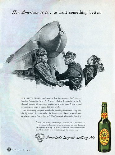
Thursday’s ad is for Ballantine’s Ale, and is from the 1950s. It features the slogan “How American it is … to want something better!” It features a then-new train engine — one I’m sure my son Porter could identify by name if he wasn’t asleep — as a symbol of progress. It’s slightly curious only the bottle itself is in color while the rest is in black and white, which I imagine was design decision to make the bottle pop.

I’m an unabashed lover of animation, which is why I always bristle when the neo-prohibitionists invariably complain when a cartoon is used to sell beer. They always argue that cartoons appeal only to children, and seem to forget that adults love them, too. Many of the most famous cartoons we love were originally made for adults, to be shown before feature films at the theater in the days before television. It wasn’t until the advent of TV, I’d argue, that the split began between cartoons for kids and for adults.
Anyway, I recently was looking for and found a bootleg DVD of old Quisp & Quake commercials, which were created by Jay Ward, famous for Rocky & Bullwinkle, among much else. And, yes, I am that much of an animation geek. Anyway, I also discovered at the same website, something I hadn’t previously known about: a Hanna-Barbera made Flintstones cartoon done in 1967 for an Anheuser-Busch distributor meeting or convention. I promptly ordered that as well.
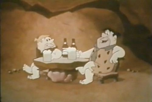
It’s a little over 19 minutes, shows some upcoming television and radio spots for Busch Bavarian Beer, but also includes a mini-Flinstones story, too, that begins when Fred and Barney lose their jobs and go to a bar to drink Busch beer. It appears aimed at distributors, and possibly retailers, to show what advertising will be used in 1967 to support the brand and help it continue to be successful. There’s some great old adspeak in the video, where the narrator talks about “advertising that moves the consumer to Busch” with what they call — and they say in hushed tones implying it’s a new term — “Target Advertising.” But here’s my favorite. “We used words that beer drinkers understood.” That had me laughing out loud. What exactly are the words that beer drinkers understand? Are they small ones? Simple ones? Ones without too many syllables?
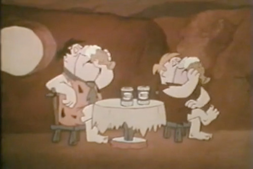
After a few minutes of a Flintstones story, going to the bar, then back home, the boys return again to the bar. The bar’s name is actually “Tavern-Type Inn Bar Grill Lounge Pub Saloon.” They agree to take over for the bartender and serve some Busch beer, then watch a video within the video that’s aimed at the distributors and talks about advertising plans for 1967. Apparently last year’s slogan was “you can’t say beer better than Busch” and the new one will be “when you’re due for a beer, Busch does it!.”
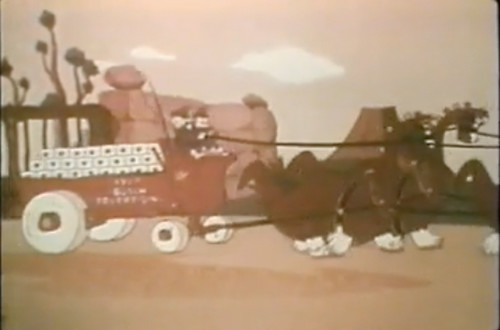
I think my favorite part of the video is when the beer wagon comes out of the A-B gate, pulled by Clydes-dinos. After the video, the 5:00 whistle sounds and Fred and Barney have to go back to work serving Busch to the after work rush. When they’re done, they talk about what hard work it was, and they throw out this bon mot, which must have delighted the crowd. “It takes know how to work in the beer business,” to which Fred replies “yeah, and we got no know how, no how.” Eventually, their boss from the gravel pit, Mr. Slate, comes in the bar and they get their jobs back, of course, wrapping up the story arc from the beginning.
It’s a fun cartoon, especially for the beer geek, and I can’t imagine how expensive it must have been to get Hanna-Barbera, one of the premiere animation studios at that time, to do an industrial film for them. Happily, you don’t have to go out and buy a copy of it like I did, but can watch it right here, because I found it on YouTube, separated into two parts. Enjoy.
Part 1: 9:22
Part 2: 9:59
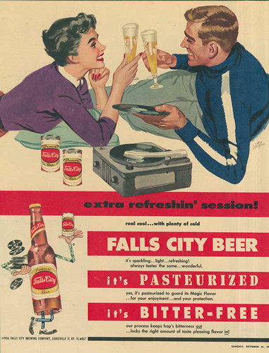
Wednesday’s ad is for Falls City Brewing, a mostly obscure brewery from Louisville, Kentucky that operated from 1905 to 1978. They’re probably most well-known nationally for Billy Beer, created with Billy Carter, President Jimmy Carter’s less-successful brother. Looking at the record-player and the records in the ad — dude, get your hands off that vinyl, don’t you know how to hold a record? — I’m guessing it’s late 50s, and on closer inspection it’s copyrighted 1956. Parts of the ad copy are hilarious. “real cool … with plenty of cold.” But this is my favorite: “It’s pasteurized to guard its Magic Flavor.”