Friday’s ad is for Schlitz, also from 1962. It’s from their “Real Gusto” campaign, and in this one a man with a crewcut is downing his beer, while holding a sandwich in one hand.

By Jay Brooks
By Jay Brooks

Thursday’s ad is for Miller High Life, also from 1962. It’s a very fake-looking western setting, just a studio with a few props — a wagon, fence and saddle. Couldn’t they have done the same shot at an actual farm or even better, a cattle ranch? Our “cowboy,” mug of beer in hand, is looking down at his new boots as the little filly on the other side if the fence looks on. I’m just not buying it.

By Jay Brooks

Wednesday’s ad is another one for Budweiser, this time from 1962. Showing a half-dozen men of varying ages out for a night of bowling — league night, no doubt — and also drinking a few beers “between frames.” It seems likes everybody was in a bowling league in the 1950s through the 1970s. My Mom was, I was as a kid. It was always fun. I also had a girlfriend briefly in high school who loved bowling — she was on the school’s team — and so spent a lot of time bowling with her, too.
There was a book a few years ago, Bowling Alone, that was all about how people no longer go out and do things in their community, instead just stay in and watch TV. It used the popularity of bowling and its recent slide as a metaphor for the collapse of the American community. It was an interesting idea, I only read part of it, but liked what I read. Hmm, I think I need to go bowling again, and soon.

By Jay Brooks

Tuesday’s ad is for Budweiser, from 1961. The very-red ad shows a greasy-haired bartender in uniform, handing you a glass of Budweiser. There’s a bowl of popcorn on the bar and a Bud lamp on the wall behind. The ad is part of A-B’s long-running “where there’s life … there’s Bud” campaign, showing their beer in a variety of settings. One thing I’m starting to notice is how unusual the glassware is in so many of the ads of this time period. I’m so used to the ubiquitous pint or shaker glass, but I can’t say when it became the standard bar glass. I spent a lot of time in bars as a kid in the late 1960s and 1970s (I had an alcoholic stepfather) and I can’t say I remember there being much in the way of unusual glassware, though I was young and not paying that close attention, so there’s that to consider.

By Jay Brooks
By Jay Brooks
![]()
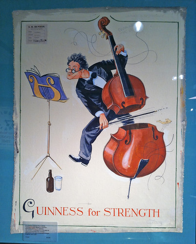
Our 102nd Guinness ad harkens back to a bygone era, when knights in shining armor battled fire-breathing dragons to rescue damsels in distress. When it’s really from, I have no idea. But when St. George prepares to battle the dragon in the distance, his squire first brings him pint of Guinness. “Guinness For Strength” reads the tagline and, somewhat humorously, a smaller dragon is also bringing the big dragon a pint of Guinness, too. Still, my money’s on St. George.

By Jay Brooks

Friday’s ad is for Pabst Blue Ribbon, from 1960. They seemed to focus on this nostalgia theme around that time, as if the 1890s or so was the best time ever for beer. I doubt that’s true, but it’s usually safe to make such a claim when few people who lived then are still around to compare or disagree. Anyone who was 20, and drinking beer, in 1890 would have been 90 in 1960. And the goofy expression with the sandwich in one hand, holding a beer up to his lips is priceless.

By Jay Brooks

In honor of Bikini Appreciation Day, Thursday’s ad is for Colt 45, from 1974. Showing the backside of a raven-haired woman in a white bikini playing the board game Bottoms Up while a side-burned lothario is looking way too intently at the game, which is especially odd since Bottoms Up is not exactly a game of strategy. In fact — believe it not — the game was commissioned by Colt 45 in 1970 and figured prominently in their advertising for a number of years. It was, not surprisingly, a drinking game. The couple here is drinking, of course, Colt 45.

The game was produced by Taurus Creations and sold for a number of years. It was even advertised in more mature Men’s magazines without the bikini.

By Jay Brooks
By Jay Brooks

Tuesday’s ad is for Carling Black Label, from 1960, from their “People try it … and they like it” series. The ad simply shows a glass of Carling Black Label being poured into a glass. I’m thirsty. But does that glass look striped? Like it’s a crystal glass with vertical indentations? Hmm. Something is making it look that way, but I can’t quite figure out why.